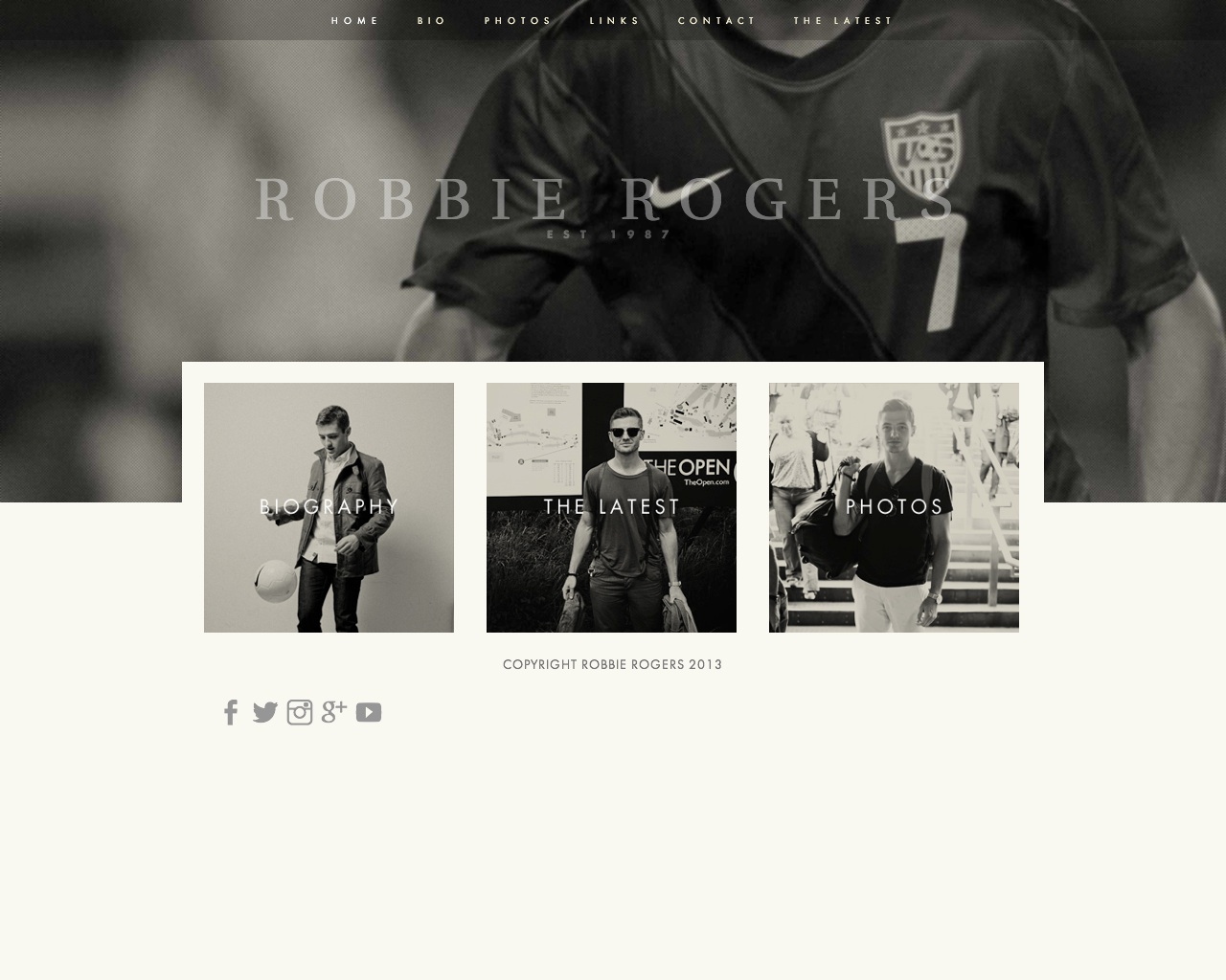
Peak is a professional business template that’s easy to setup and comes with a wide assortment of customization options. Peak is prized by small and mid-sized businesses for its bold imagery and clean presentation.
Sizes & Values
Site Width – control the width of the content area for the site.
Navigation Spacing – determine the spacing around each navigation link.
Banner Padding Top – sets the spacing above the site title inside the banner.
Banner Padding Bottom – sets the spacing below the site title inside the banner.
Banner Padding Left/Right – sets the spacing on either side of the site title inside the banner.
Banner Image Height – controls the overall height of the banner image itself.
Tagline Padding Top – set the padding above the site tagline (if present).
Page Padding Top/Bottom – assigns a padding amount to the top and bottom of the page content area.
Page Padding Left/Right – assigns a padding amount to the left and right of the page content area.
Footer Padding Top/Bottom – assigns a padding amount to the top and bottom of the footer area.
Footer Padding Left/Right – assigns a padding amount to the left and right of the footer area.
Footer Margin Top – adds additional space above the footer, below the page content.
Blog Post Spacing – controls the spacing between each blog post on the list view.
Template Options
Navigation Position – determine whether the navigation scrolls with the page or sticks at the top of the window.
Show Page Title – enable the page title to be shown at the top of the content area.
Show Page Description – enable the page description to be shown at the top of the content area.
Hide Social Icons – toggle whether social icon links are visible or not.
Gallery Styles
Gallery Navigation – determines the type of gallery image navigation is provided on the page.
Gallery Info Overlay – select the type of display used for image title and caption.
Gallery Aspect Ratio – controls the aspect ratio (width:height) for the gallery active slide.
Gallery Arrow Style – determines the style of the arrows used to cycle through the slides.
Gallery Transitions – select the transition styles used to animate between slides being viewed.
Gallery Show Arrows – choose to use arrows for cycling through slides.
Gallery Auto Crop – choose to auto crop slide images to the selected ratio.
Gallery Autoplay – choose to cycle gallery images automatically without user interaction.
Gallery Loop – enable a gallery to cycle through to the first slide after the last slide.
Gallery Autoplay Speed – specify the speed at which the gallery pauses on the active slide.
Gallery Thumbnail Size – control the height of thumbnail images when used for gallery navigation.
Gallery Arrow Background – specify the color that is used for the shape of gallery arrows.
Gallery Arrow Color – specify the color that is used for the arrow itself.
Gallery Circle Color – specify the color that is used for the circle shape gallery arrows.
Gallery Info Background – specify the color used in the background of the image title and caption.
Product Styles
Product Background Color – sets the color behind the product image.
Product Overlay Color – sets the color of the overlay when product list titles are set to ‘overlay.’
Products Per Row – determines the number of products shown per line on the product list.
Product List Titles – controls the position of the product title on the product list.
Product List Alignment – sets the text alignment of the product title on the product list.
Product Item Size – select an image ratio for the product photo on the product list.
Product Image Auto Crop – determines whether product images fill the image area or fit within.
Product Gallery Size – select an image ratio for the product gallery on the product item page.
Product Gallery Auto Crop – determines whether product images fill the gallery area or fit within.
Show Product Price – shows the price on the product list page when enabled.
Show Product Item Nav – shows the ‘back to shop’ link on the product item page.
Event Styles
Event Time Format – toggle between 24 hour or AM/PM for event times.
Event Icons – enable icons on the address and event time display.
Event Thumbnails – show an image thumbnail in list view.
Event Thumbnail Size – controls the size (ratio width:height) of the event thumbnail image.
Event Date Label – enable date overlay on top of event thumbnail.
Event Date Label Time – include the time of the event with the date overlay.
Event Excerpts – show optional excerpt text of events on the list view when present.
Event List Date – show the full event date (day, month, year) of the event on the list view.
Event List Time – show the time range (start time-end time) of the event on the list view.
Event List Address – show the event location address when present.
Event iCal/gCal Links – show links to add events to Apple or Google calendars.
Event Like and Share Buttons – show Squarespace simple like and share buttons on events.
Event List Compact View – enable a simple stacked view of events in the list view.
Event Calendar Compact View – enable a simpler calendar view optimized for smaller areas.